← Back

Product + HMI · Retail · July 2025

Self-Checkout Counters

A Scan, Pay, Bag self-checkout counter for Indian clothing stores, with a guided interface and no staff needed to remove security tags.

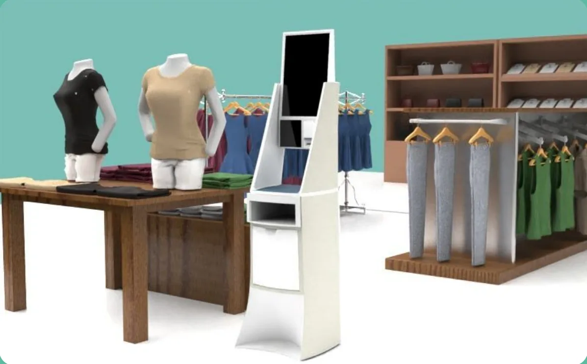
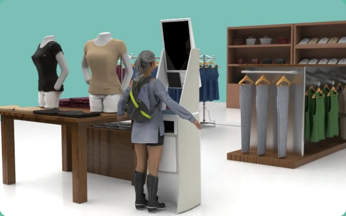
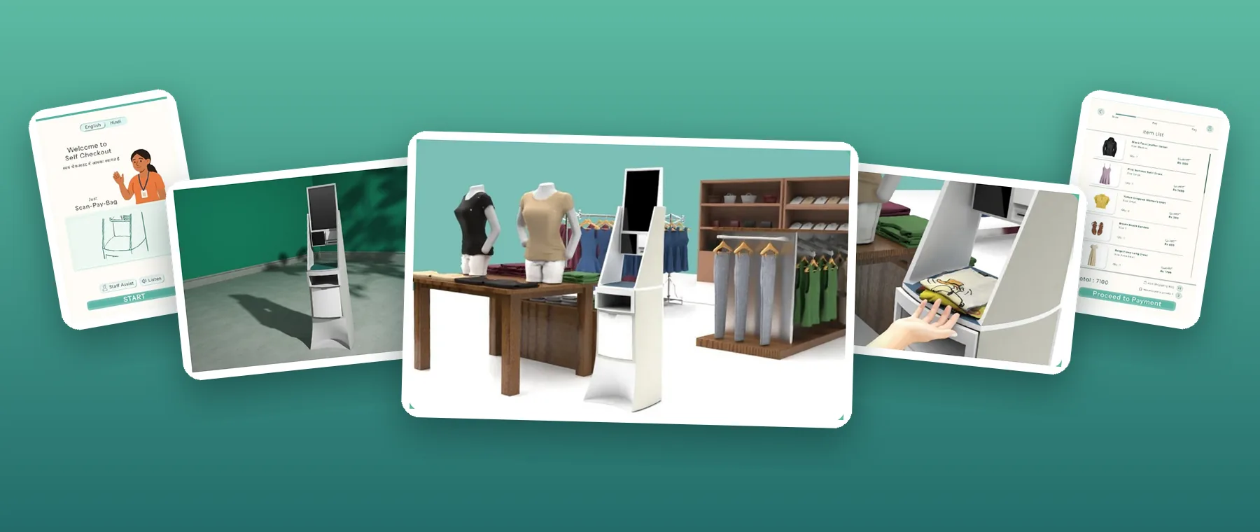
Renders of the redesigned self-checkout counter in a clothing store, with its interface screens
My role
HMI: user journey, interface system and checkout flow
Timeline
4 weeks
Team
4 people
Tools
Figma

Team: Aaditya Yerawar, Ananya Godase, Harshita Sundeep Singh, Haya Maria Paul. My teammates designed and built the physical enclosure.

TL;DR

Problem
Self-checkouts in Indian clothing stores are adapted from Western supermarkets. First-time shoppers get stuck on text-heavy screens, and staff still have to remove hard security tags, so the “self” part breaks.
My role
I designed the end-to-end user journey, the interface system and the checkout flow. The team researched together; my teammates built the enclosure.
Solution
One counter, three steps: Scan, Pay, Bag. A picture-led interface guides each step, and paper RFID tags with EAS chips deactivate at payment, so nobody has to remove a tag.
Result
A complete concept: counter form, CAD and the full interface flow. It has not been usability-tested with shoppers yet; the test plan is at the end.
01 · The problem

A machine built for someone else’s shoppers

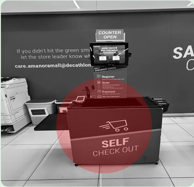
  • Context mismatch. Existing counters are adapted from Western setups and don’t fit how Indian shoppers behave or what they expect.
  • Hard tags still need staff. Shoppers have to walk back to a cashier to get security tags removed, which defeats the point of self-checkout.
  • Confusing for first-timers. Text-heavy screens, unclear next steps and no language options send people looking for help.
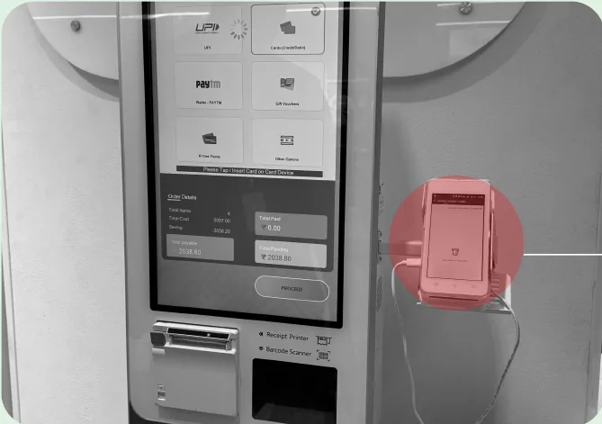
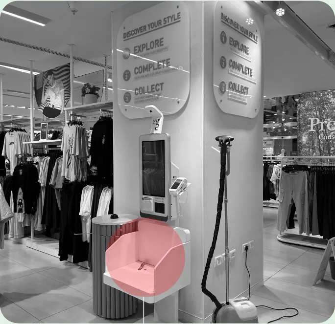
  • It looks like a machine, not part of the store. Screen, card reader and bagging feel like separate add-ons.
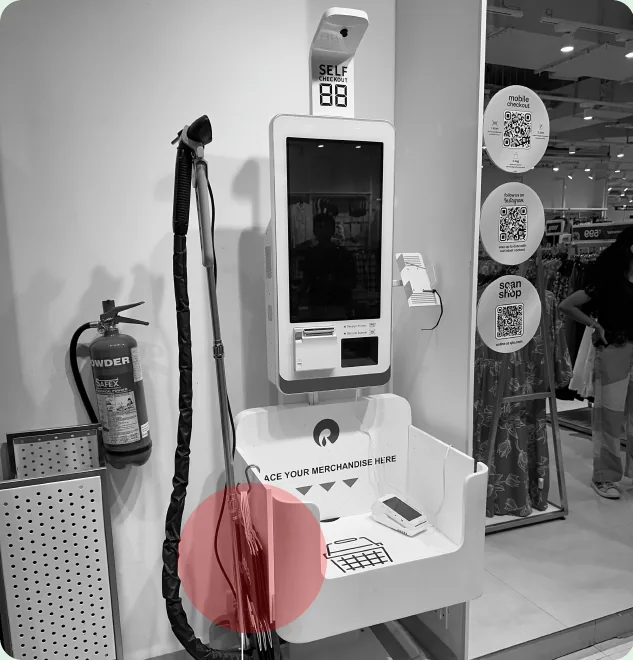
Bagging area at an existing self-checkout that isn't theft-proofCard machine standing separately from the self-checkout counterOversized RFID scanning basket at DecathlonOversized RFID scanning basket in a clothing store

02 · Research

Watching both sides of the counter

2 store visits: Azorte & Decathlon10 shoppers & store staff interviewed5 self-checkout systems audited5 design criteria

What we heard

  • Tags mis-scan, double-scan or get missed, so staff are called in often.Store employee, Azorte
  • Going back to the cashier to remove hard tags takes too long.Shopper, fashion design student
  • Doesn’t trust RFID accuracy: unclear confirmation cues.Shopper, office manager
  • Uncomfortable sharing personal data at the machine.Shopper, UX design student
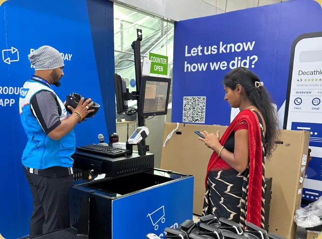
A Decathlon employee helping a shopper at the self-checkout
Even at Decathlon’s self-checkout, an employee stands by to help. The machine still depends on staff.

Competitive audit of 5 systems

No system did well across all the UX criteria we looked at. Most compete on features rather than clarity, lean on on-screen instructions instead of physical cues, and treat the scanner, payment and receipt as separate parts rather than one flow.

Design brief

Design an intuitive self-checkout counter that prevents theft in Indian clothing stores and supports independent use by diverse shoppers.

Inviting, not intimidating for first-time users
Form follows the flow, leading from one action to the next
Less time to complete the whole checkout
Multilingual voice help to make it inclusive
Tag removal built in, without opening a theft gap

03 · Concepts

Five concepts, tested in cardboard

  1. StackablesWall-mounted units that stack on a peg-board as crowds grow.
  2. Adjustable ladderScreen and basket slide up and down to suit each user’s height.
  3. ModularThree units that stores can arrange to fit their floor.
  4. Split counterTwo screens: one to scan and pay, one to return unwanted items. Tags come off automatically.
  5. Scanning bagA cart that scans as you shop and builds a list on your phone.
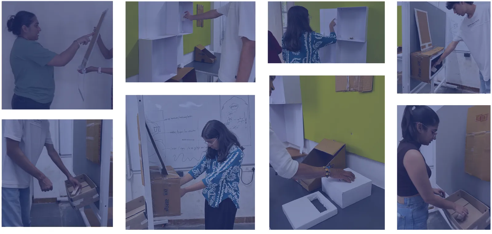
Eight photos of participants testing cardboard mock-ups: reaching a screen panel, adjusting its tilt and placing items into a scanning basket
We built cardboard mock-ups and tested them with participants to set the screen height, screen tilt and basket height.
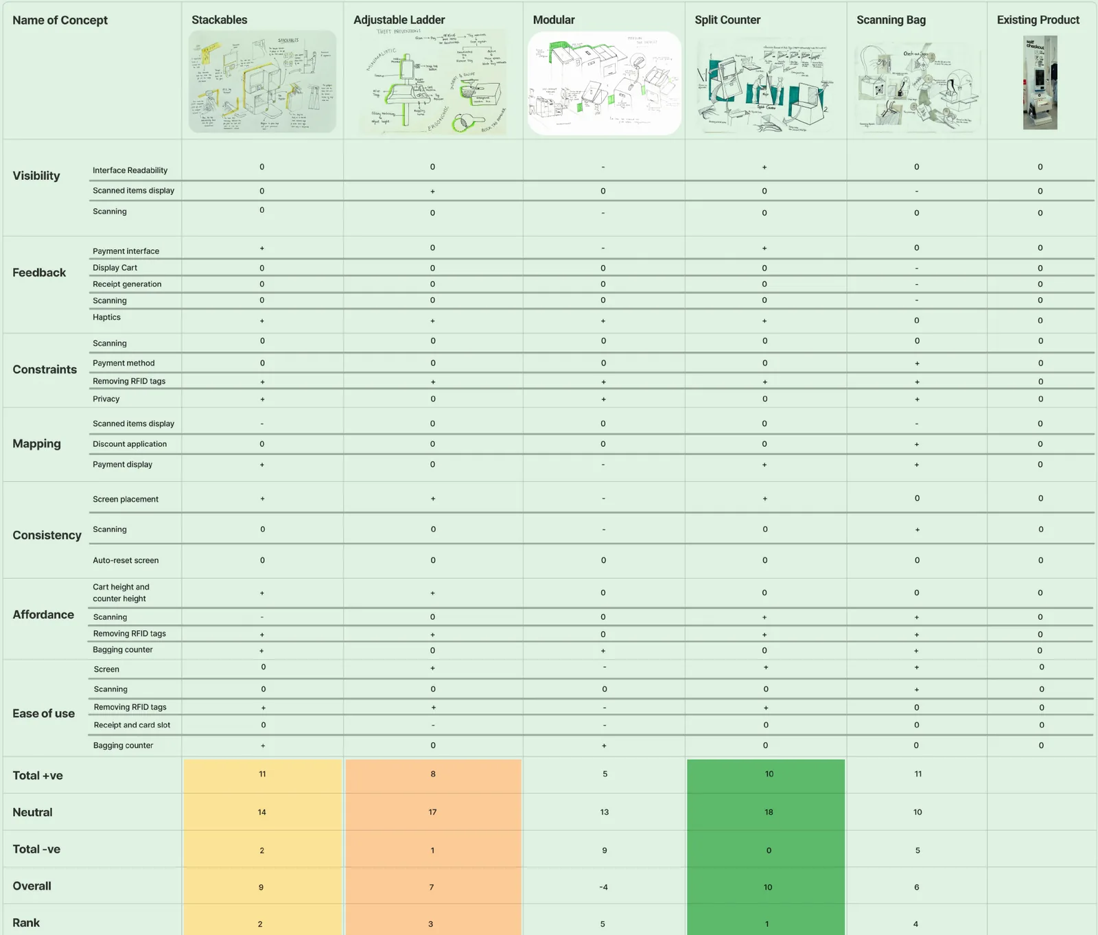
Pugh matrix scoring the five concepts and the existing product on visibility, feedback, constraints, mapping, consistency, affordance and ease of use; the split counter ranks first
Pugh matrix · ranked #1

Why the split counter won

It scored highest against the other four concepts and the existing machine, and participants preferred it in testing because:

  • Tag removal is fully automatic
  • It helps manage the queue
  • Shoppers don’t feel watched while they check out

04 · Key insight

The best tag-removal mechanism is no removal at all.

  1. 1Testing picked the split counter. Users liked its automatic tag removal most.
  2. 2Its removal mechanism had pending patents. We couldn’t pursue it.
  3. 3We tried a magnetic-suction detacher. It worked, but still relied on removing tags, which limited scale.
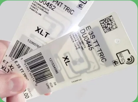
  4. 4Paper RFID tags with EAS chips make removal unnecessary. Target, Uniqlo, Zara and Decathlon already use them.
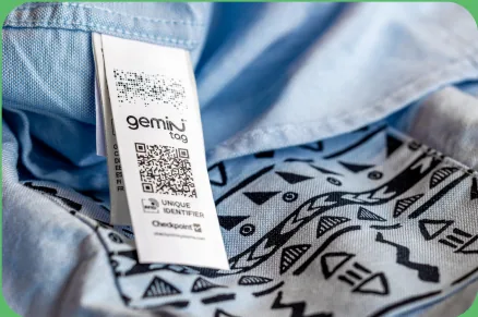
  5. 5Stitched into the garment. Not the label, so they’re hard to tear off. They deactivate after payment.
Paper RFID tagsRFID tag sewn into a garment label

No staff needed to remove tags, and no tag-removal step for the shopper. That is what made a three-step flow possible.

05 · The counter

Scan. Pay. Bag. Built into one counter.

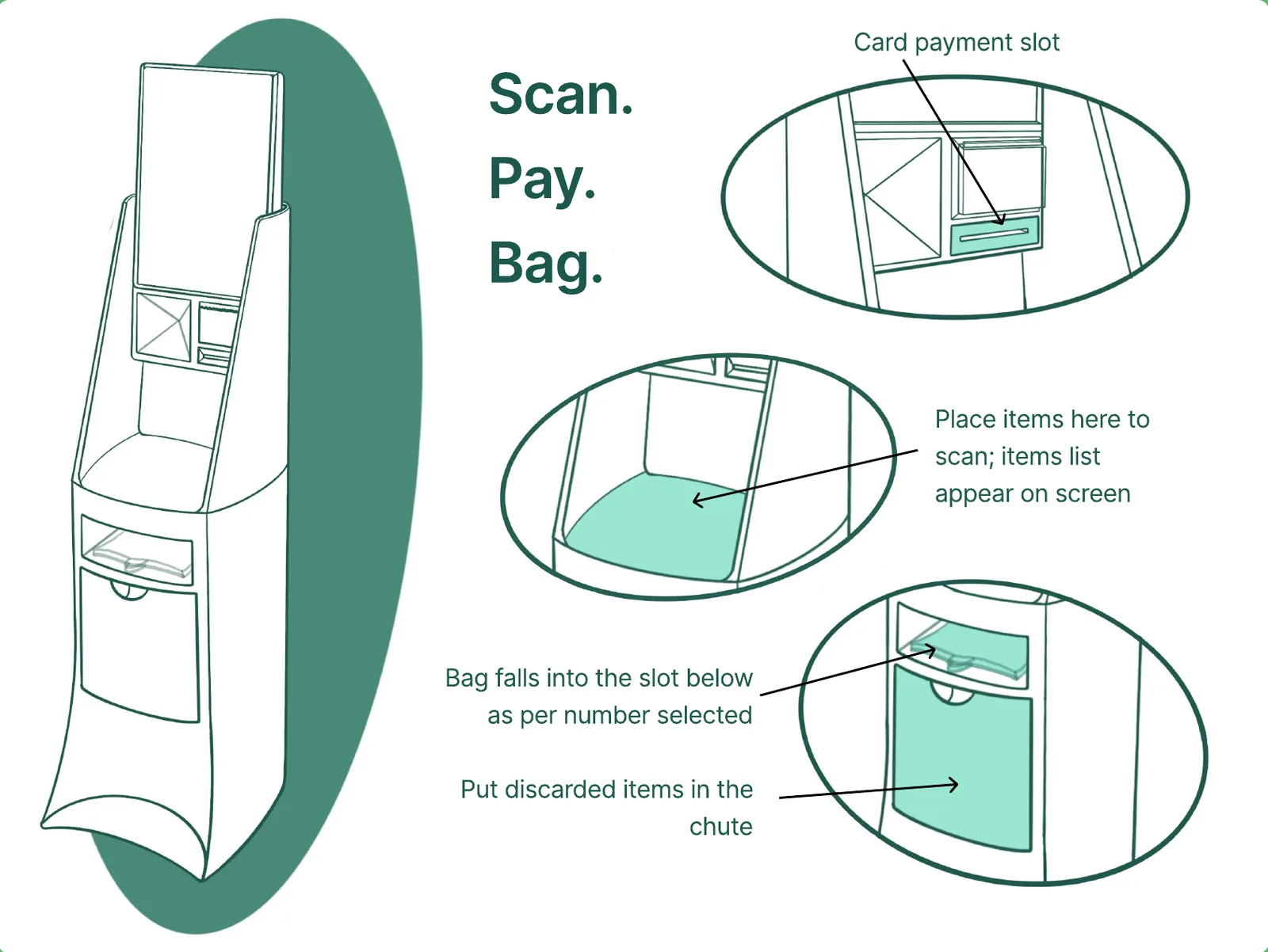
Final concept diagram: scanning basket, card slot, bag dispenser and discard chute
  • ScanDrop items in the basket; they appear on screen.850–950 mm
  • PayCard tap or insert slot built into the body, plus UPI.~1000 mm
  • BagChoose how many bags; they drop into the slot below.600–700 mm
  • ReturnChanged your mind? Put the item in the chute.

Overall height 1650 mm, based on average Indian eye level. Screen kept smaller than existing machines for privacy. Enclosure designed by my teammates; the zones follow the flow I mapped.

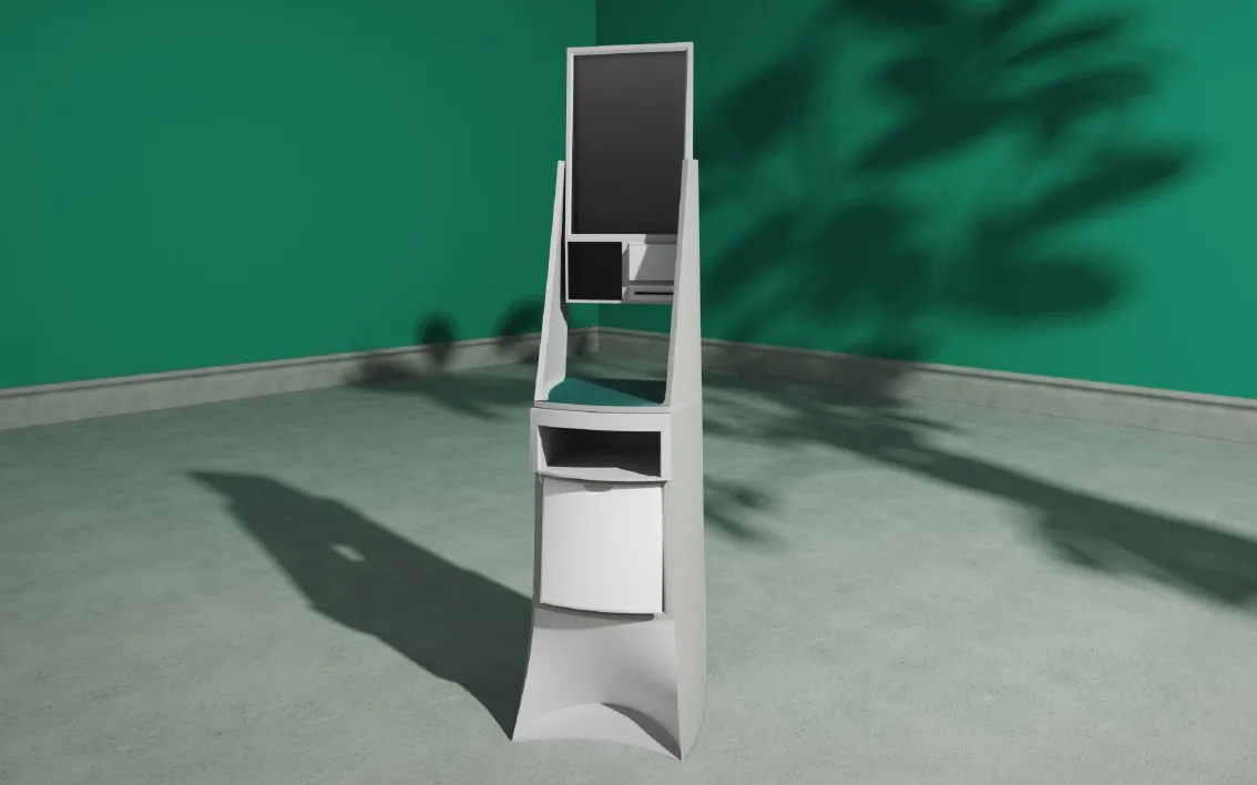
Render of the counter in a clothing storeRender of a shopper using the counterCAD render of the counter

06 · Interface · my work

Three decisions that shaped the screens

Why only three steps

What I saw

Existing flows, such as the Markss machine we mapped, ask for login, item-code entry and several confirmations. Shoppers described them as confusing, slow and repetitive, and one of our criteria was less time to check out.

So I

Grouped the whole journey into Scan, Pay and Bag, shown as a progress bar at the top of every screen, with one main action per screen. Shoppers always know where they are and what’s left.

Why product images, not item codes

What I saw

On existing machines, an item that doesn’t scan has to be added by typing its code, and the text-only item lists make it hard to cross-check what has been scanned.

So I

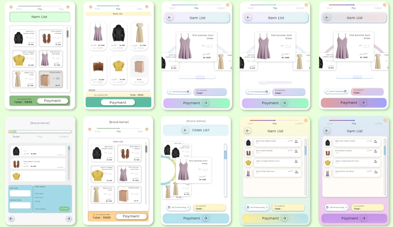
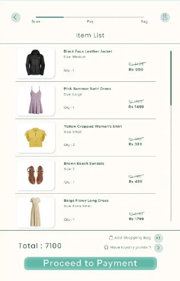
Showed each garment as a photo with its name, size and price, so shoppers can check their basket at a glance before paying. I explored several layouts before settling on the list.

Why personal details aren’t asked first

What I saw

The Markss flow asks for a phone number or email before you can scan anything. A shopper we interviewed was uncomfortable sharing personal data at the machine.

So I

Let people start scanning straight away. The phone number is only asked if they choose to use loyalty points, and they can skip it. The receipt is offered as SMS or print.

Ten iterations of the item list screen: grid and list layouts, a carousel, and different colour treatments for the Scan, Pay, Bag progress bar
Item list iterations: grids, a carousel and a list, before landing on the final layout.

The final flow

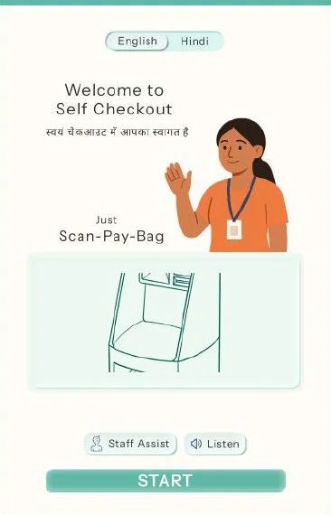
Icons, illustrations and one action per screen replace text-heavy menus. English/Hindi choice, Staff Assist and Listen (voice) buttons stay on screen throughout. The teal palette matches the modern fashion brands these stores carry and stays readable under bright retail lighting. Type: Instrument Sans.

Welcome screen with English and Hindi options, Staff Assist and Listen buttons, and a Start button
WelcomeLanguage choice
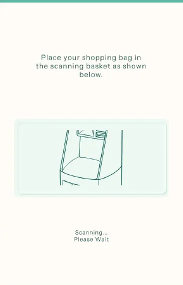
Screen showing where to place items in the scanning basket
Place itemsShown as a picture
Item list with a photo, name, size and price for each garment, and the total
Item listCheck before paying
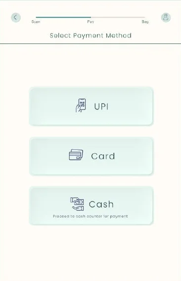
Payment method screen with UPI, card and cash options
PaymentUPI, card or cash
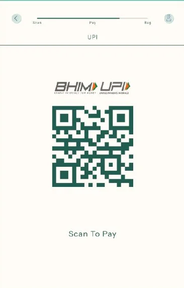
UPI payment screen with a QR code to scan
UPIScan the QR
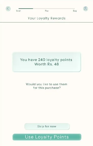
Loyalty points screen offering to use points or skip
Loyalty pointsUse them or skip
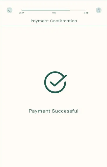
Payment successful confirmation screen
PaidClear confirmation
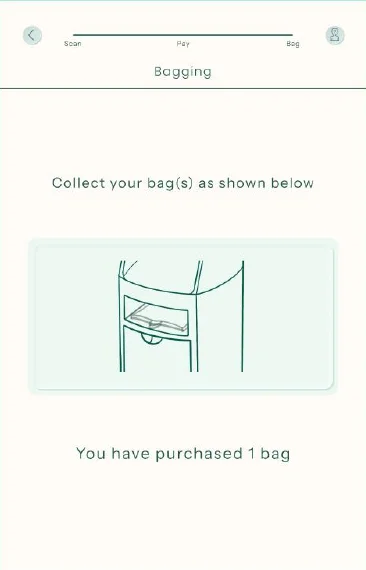
Bagging screen telling the shopper to collect their bag from the slot below
BagCollect from the slot
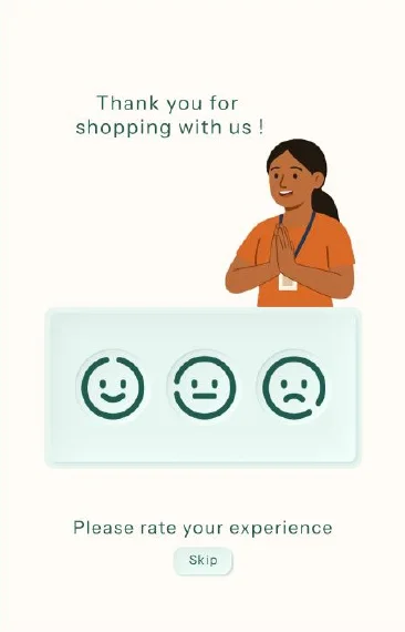
Thank-you screen with three faces to rate the experience
RateOne-tap feedback

Error and recovery states

Mis-scans and failed payments were the most common complaints in research, but the flow above covers the happy path only. These are the states I’d design next.

Failed or missed scanShow which item the counter expected but didn’t detect, as a photo, with “Try again” and “Call staff”. The cart stays as it is.
Failed paymentKeep the cart, say plainly that no money was taken, and return to the payment options with the failed method marked.

07 · Compared with today’s machines

What changes for the shopper

Existing countersOur counter
Tag removalHard RFID tags removed by staffPaper RFID stitched in, deactivates after payment
FormBoxy; screen, reader and bagging look like separate partsOne cohesive counter that fits a clothing store
ErgonomicsFixed screen angle, low bagging areaDefined heights for scanning, paying and bagging
InterfaceCluttered and text-heavy; users ask staff what’s nextThree steps with a progress bar, photos and one action per screen
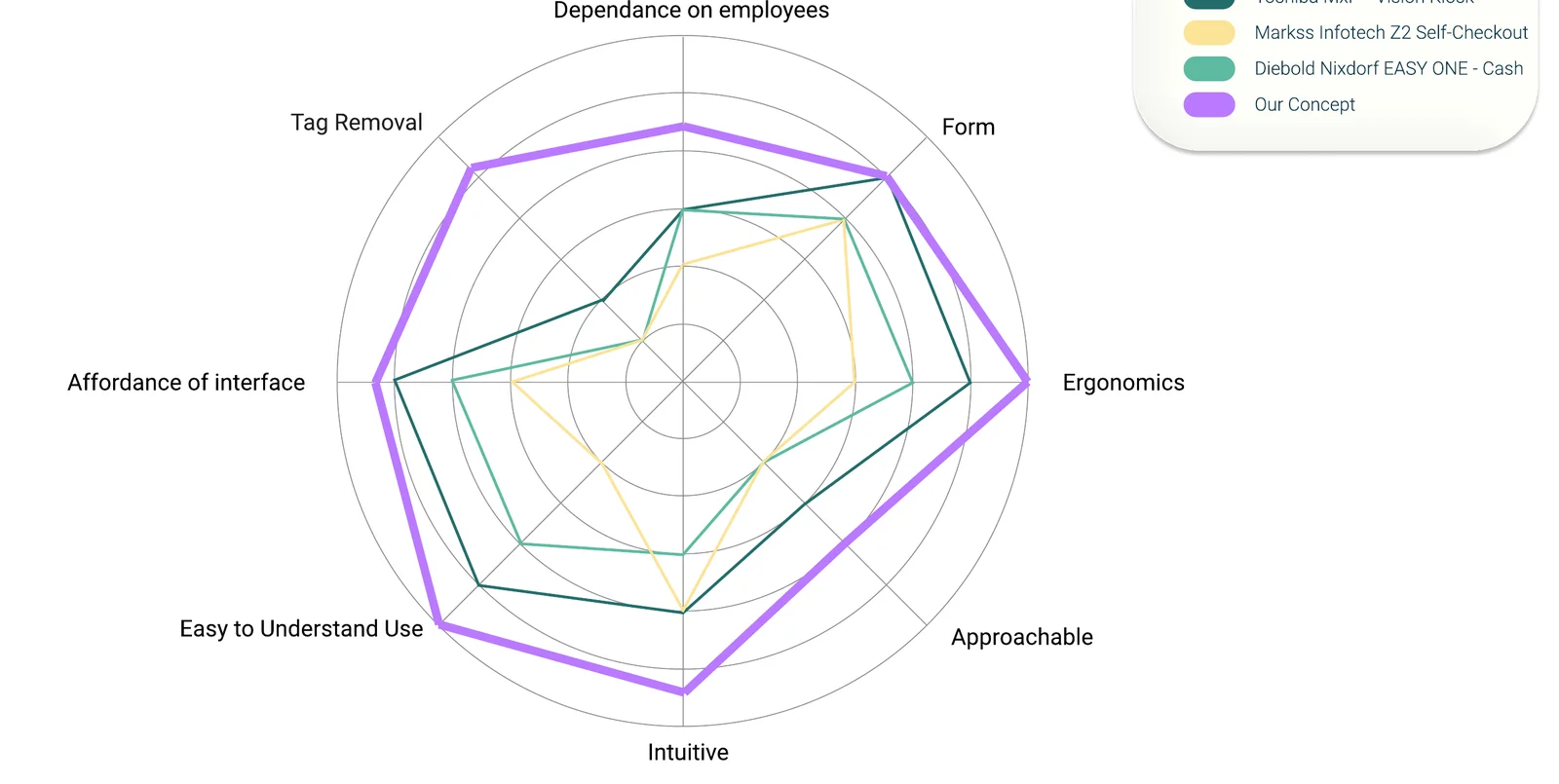
Radar chart comparing our concept with Toshiba, Markss and Diebold Nixdorf machines

Our team’s own heuristic comparison against three machines on the market (Toshiba MxP, Markss Infotech Z2, Diebold Nixdorf EASY ONE) across eight criteria, including tag removal, dependence on employees, ergonomics and how intuitive it is. This is an expert review, not a test with shoppers.

08 · Validation · next step

How I’d test it with shoppers

Our cardboard testing set the counter’s heights and angles. The interface itself hasn’t been tested with shoppers yet, so I’m not claiming it is faster or easier. This is the test I’d run first.

Who and what

  • 5 shoppers who rarely use self-checkout
  • Clickable prototype on a screen mounted at the tested height
  • Task: check out three garments, pay by UPI, collect the bag

What I’d measure

  • Task completion
  • Time to complete
  • Errors, such as wrong taps or backtracking
  • Times they reach for “Staff Assist”

Compared with

  • The same task timed on an existing machine, for a baseline
  • Then a second round on the failed-scan and failed-payment states

09 · Reflection

What I’d do differently

  • A blocked idea led to the better one.Losing the split counter’s detacher to a patent made us ask whether tags needed removing at all. That question did more for the flow than any screen change.
  • Test the screens, not just the cardboard.We validated heights and angles with people but only reviewed the interface ourselves. Next time I’d put a rough prototype in front of shoppers in the first week.
  • Design for failure first.Mis-scans and failed payments came up again and again in interviews, yet my flow only covers the happy path. I’d start the next round there, and test with older and first-time shoppers.

Want the detail?

Personas, journey maps, ideation sheets and anthropometrics are in the full deck.

See the full process deck →