← Back

Design system · Web · September 2026

NoBroker

A design-system revamp built around one idea: show renters the restrictions and preferences that matter before they invest time in a listing.
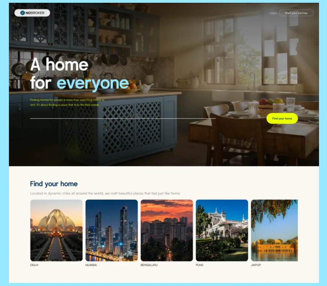
Redesigned NoBroker homepage headed ‘A home for everyone’, with city cards below
My role
Product audit, research and the final prototype (Figma auto layout and variables)
Timeline
5 weeks
Team
5 people
Tools
Figma

Team of 5. I did the product audit, the research that found the new direction, and built the final prototype in Figma using auto layout and variables.

TL;DR

Problem
Renters often find out that bachelors or pets aren’t allowed only after they’ve invested time in a listing, and vague preference labels leave them unsure a home is meant for them.
My role
Product audit, research and the final Figma prototype, in a team of five.
Solution
Make restrictions and preferences visible early: preference chips and lifestyle filters in search, the same tags on every property page, and a design system so they look the same everywhere.
Result
A design system and desktop prototype. It hasn’t been tested with users yet; testing the chips with renters and owners is the next step.

01 · The problem

You find the flat. Then you find out you can’t live there.

Have you ever liked a flat, only to learn later that bachelors aren’t allowed, and had to start the search again?

8 semi-structured interviews in PuneStudents, working professionals, couples, families and homeowners
  • Key insightUsers often discover important restrictions only after investing time in a property.
  • Key insightVague preference labels make users unsure whether a property is meant for them.
  • InsightUsers adapt their search to the categories available, even when those categories don’t describe their situation.
  • InsightThe absence of information can become a reason not to enquire.
  • InsightA property can match the checklist and still feel like the wrong home.
  • InsightA good search reduces uncertainty around the right homes, not just the number of results.
Portrait of Rohan Mehra

Rohan Mehra, 26

Independent renter, relocating to Pune

I want to know whether I can actually live there, not just whether I can afford it.

Portrait of Aditi Shah

Aditi Shah, 34

First-time home buyer, Pune

I’m trying to figure out whether this is the right place for the life I want to build.

Portrait of Meera Kulkarni

Meera Kulkarni, 52

Owner renting out a 2BHK in Kharadi

I just want the expectations to be clear from the beginning.

Personas built from the interviews; quotes are written in each persona’s voice.

02 · Product audit

The same job, built a different way on every screen

Before designing anything, I audited NoBroker’s live site. In principle, every screen uses five brand colours and one typeface. In practice, both drift from screen to screen, because nothing comes from a shared token library.
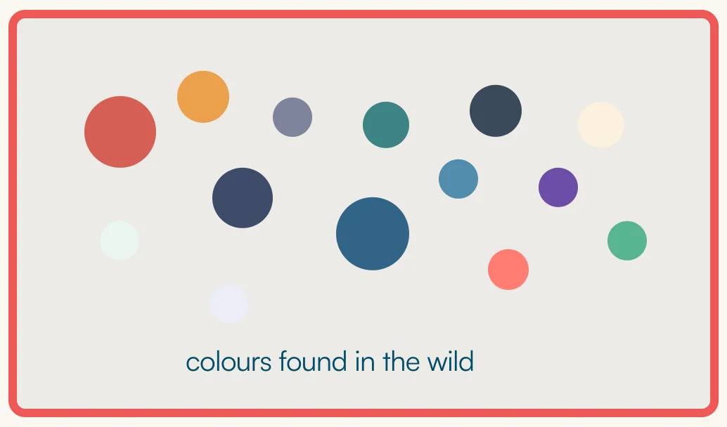
Dozens of slightly different colours found across live NoBroker screens

Colour

Five intended brand colours become dozens in the wild. Red and teal are both used for main buttons, with no rule for which action gets which.
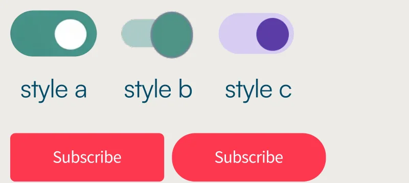
The same toggle drawn in three styles, and two differently shaped Subscribe buttons

Components

The same toggle ships in three shapes, with corner radius drifting from 2px to 14px. Hover and focus states are documented but not applied.
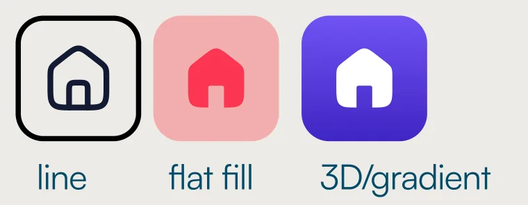
The home icon drawn as a line icon, a flat filled icon and a 3D gradient icon

Icons and type

“Home” is drawn three ways across navigation, services and ads. The same heading level ships at 18, 22 or 24px, with odd values like 15.75px.

See the full audit →

03 · The solution

Show the restrictions before people fall for the flat

“A home for everyone” is the brand ambition, not a promise. Owners still set restrictions, and they should be able to. The design’s job is to make those restrictions and preferences visible early and in plain words, so nobody wastes a visit and nobody feels they have to justify how they live.

1

Preference chips

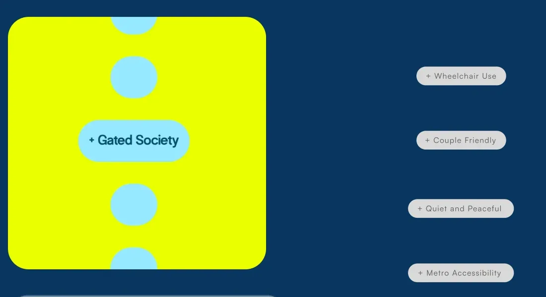
One-tap chips such as “Couple Friendly” and “Wheelchair Use” let people describe what they need, instead of squeezing into fixed categories.
2

Lifestyle filters up front

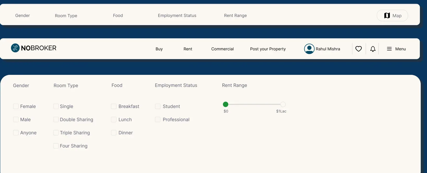
Gender, room type, food and employment status sit in the main filter bar, next to rent, rather than deep in a sidebar.
3

The same tags on every listing

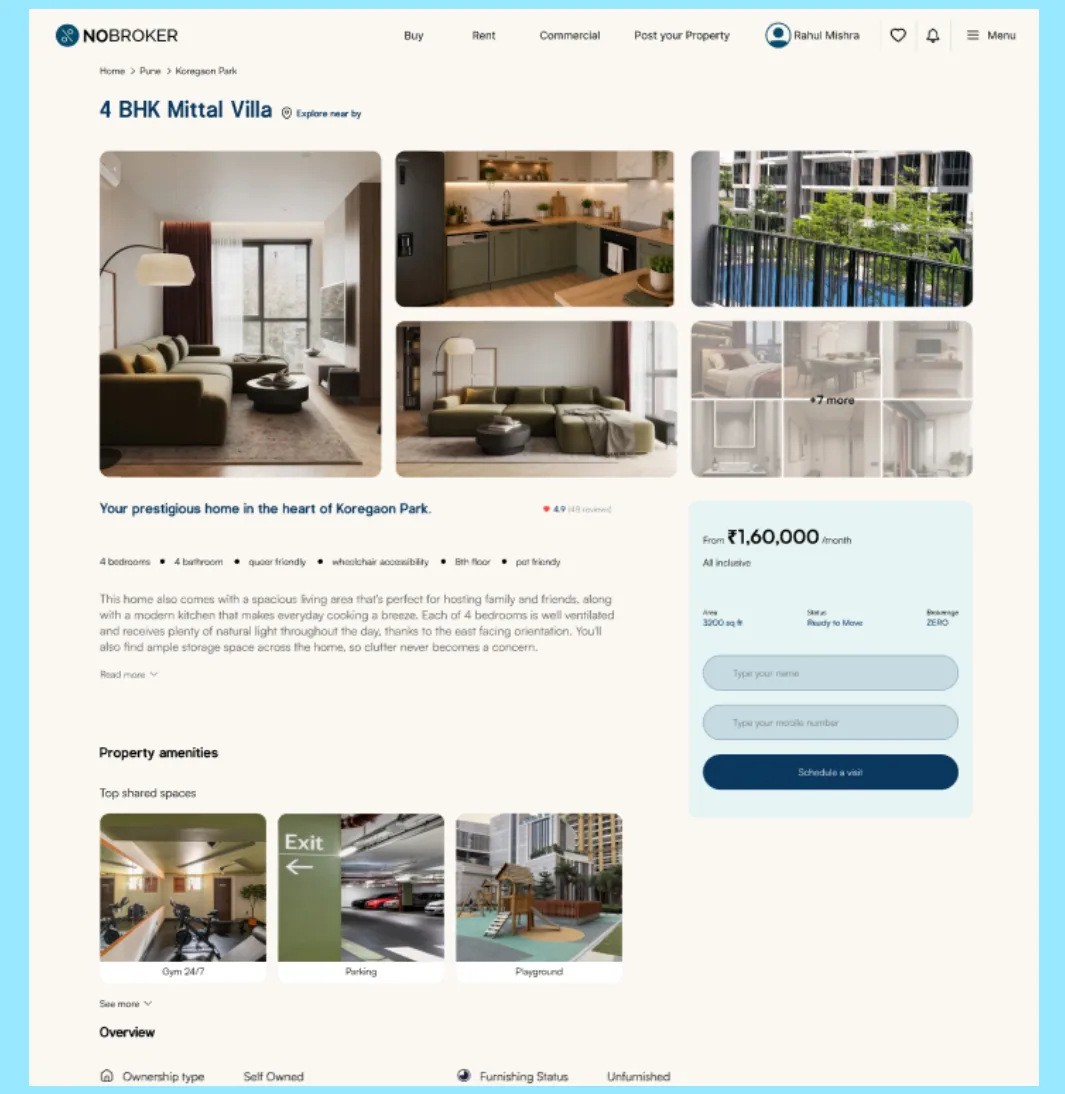
Each property page repeats what’s allowed and what isn’t, near the top, in the same chip style used in search.
+ Couple Friendly+ Wheelchair Use+ Quiet and Peaceful+ Metro Accessibility+ Gated Society

Step 1 · Searching

Before
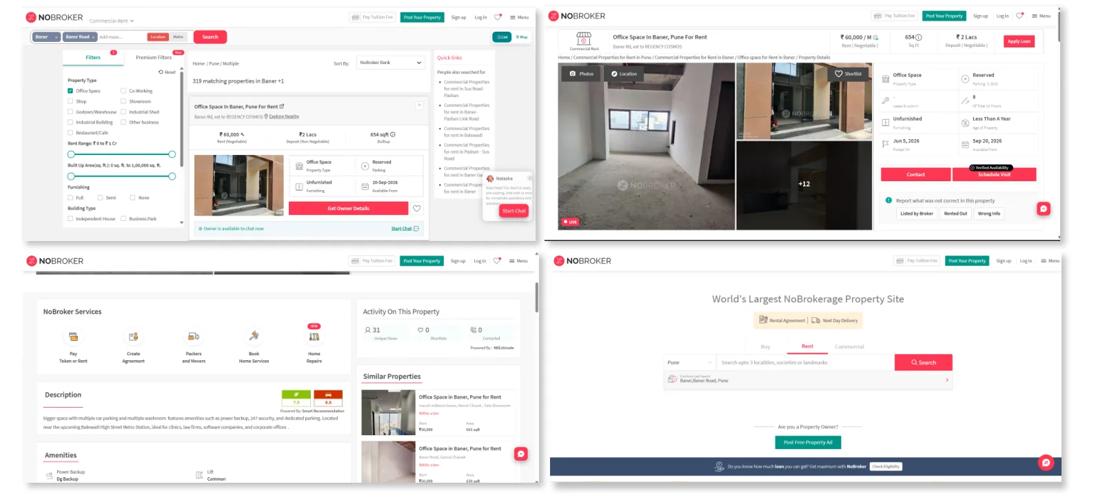
Existing NoBroker search and listing screens with a long, text-heavy filter sidebar
Preferences live in a long sidebar of small checkboxes. Many restrictions only come up after contacting the owner.
After
Redesigned filter bar with gender, room type, food, employment status and rent range, expanded into clear checkbox groups
Lifestyle filters sit in the main bar and open into clear groups, so people narrow by how they live, not just by price.

Step 2 · Deciding

The component
Preference chips, designed as a reusable component so search and listings use the same words and style.
On the listing
Redesigned property page for a 4 BHK villa, with tags such as wheelchair accessibility and pet friendly listed under the title
The property page lists what’s allowed (pet friendly, wheelchair accessibility and more) right under the title, before the gallery and price.

Prototype walkthrough

Open the Figma prototype ↗

04 · Brand to interface

One personality, turned into rules for the screen

The brand stands for being welcoming, respectful and non-judgemental: you don’t have to fit a mould to find a home. Each personality trait became concrete interface rules, and the principles below kept every screen honest to them.

Non-judgemental

  • Neutral language
  • Calm hierarchy
  • No aggressive warnings

Empowering

  • Clear hierarchy
  • Strong user-control states
  • Informs rather than commands

Open-minded

  • Flexible layouts
  • Diverse imagery
  • No rigid categories

Warm

  • Human imagery
  • Softer shapes
  • Approachable type
  1. Show, don’t make people ask
  2. Describe needs, not people
  3. Don’t define the ‘normal’ user
  4. Inform without judging
  5. Represent possibility, not stereotypes
  6. Never make inclusion a ‘special mode’
  7. Make the interface feel like a welcome, not a checkpoint

05 · Design system

The system behind it

Built in Figma with auto layout and variables, so chips, filters and cards stay consistent across every screen.

Colour, and where each one may go

#FBF8F3Off-white · 46%
Page backgrounds

#FFFFFFWhite · 20%
Cards and inputs

#0A3860Deep blue · 14%
Text, main buttons

#97E8FFLight blue · 12%
Chips, highlights

#EAFF00Neon yellow · 8%
Accent fills only

Contrast rules

  • Neon yellow is a fill, never text. On off-white it has a 1.05:1 contrast ratio, which is invisible. Use it only behind deep-blue or black text (10.8:1 and 18.8:1), e.g. the main call-to-action on a photo or dark background.
  • Light blue is a fill, never text. Use it behind deep-blue text (8.8:1), as in the preference chips.
  • All body text is deep blue or black on off-white or white (11.3:1 or higher).

Typography

Typefaces: Cotton for headlines, Satoshi for body text
Body sample · Satoshi 16pxCouple friendly, pets welcome and a 10-minute walk to the metro. Here’s everything you need to know before you visit.
StyleFontSize
H1Cotton Regular72px
H2Cotton Regular64px
H3Cotton Regular48px
H4Cotton Regular32px
BodySatoshi Bold · Medium · Regular16px
SmallSatoshi Bold · Medium · Regular12px

Grid and spacing

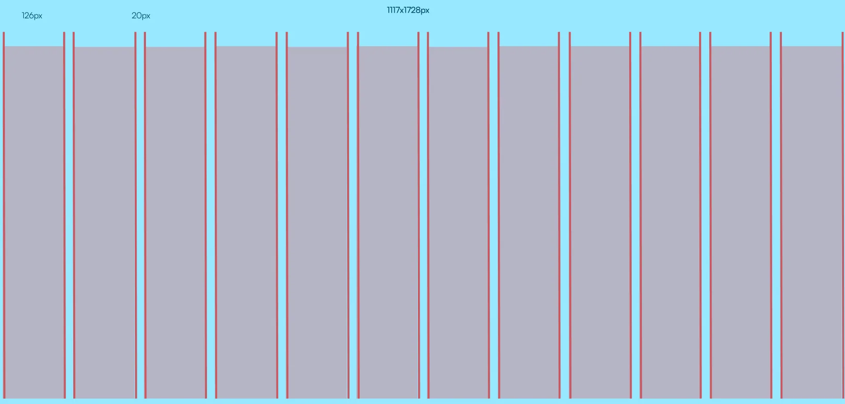
12-column grid with 126px margins and 20px gutters
12-column grid: 126px margins, 20px gutters.
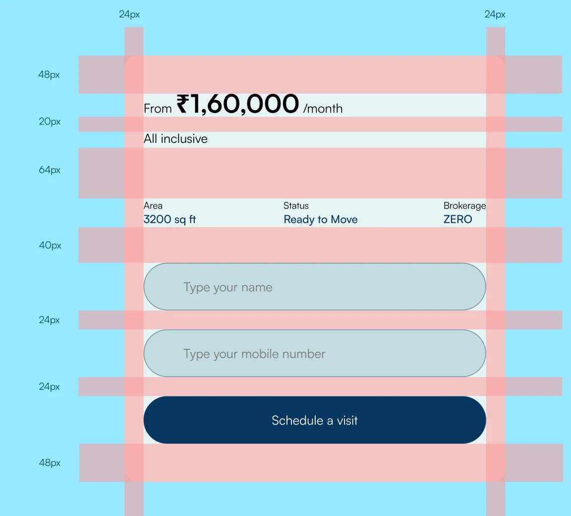
Spacing applied to a property card in 24, 40, 48 and 64px steps
Spacing in repeatable steps, applied to a property card.

Buttons

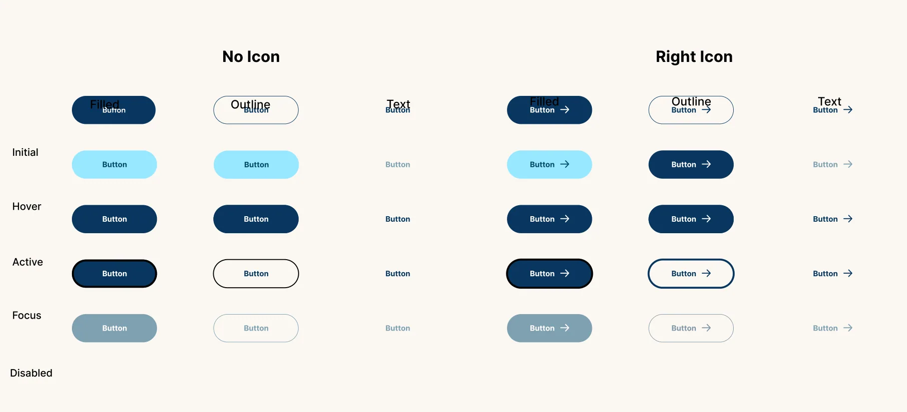
Button states: initial, hover, active, focus and disabled
Every state designed: initial, hover, active, focus, disabled.
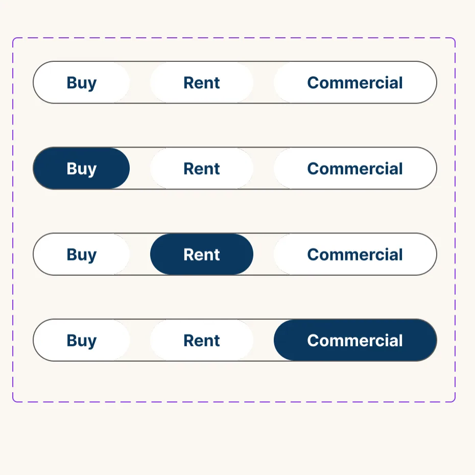
Segmented tabs for Buy, Rent and Commercial in each selected state
Segmented tabs for Buy, Rent and Commercial.

Do

  • Use a filled button for the one main action on a screen, such as “Schedule a visit”.
  • Use an outline button for secondary actions.
  • In tab groups, show the selected tab as outlined.
  • Keep button height and padding the same everywhere; let width follow the label.

Don’t

  • Don’t vary button height between buttons.
  • Don’t change padding or text size when a label gets longer.

Inputs, cards and variables

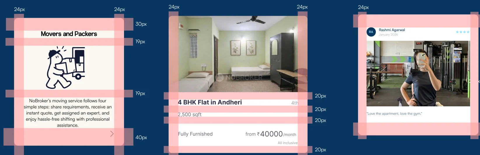
Card spacing tokens on service, property and review cards
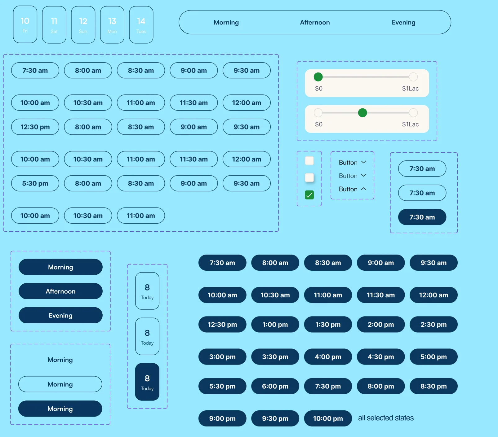
Date, time-slot and time-of-day selectors with all their states
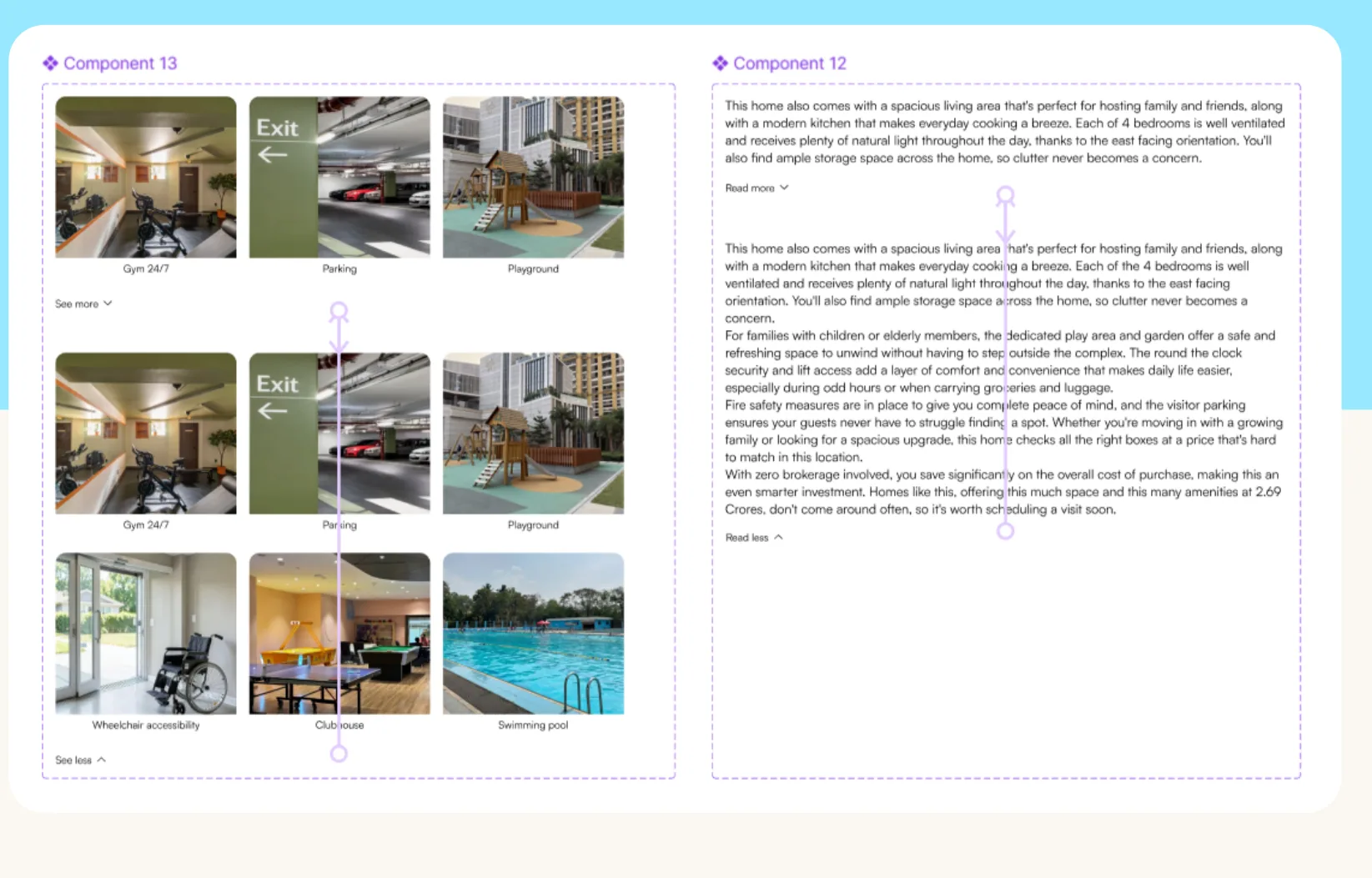
Amenity gallery component and expandable description component

Icons, illustration and language

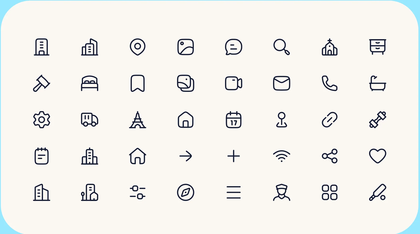
Icon set of 40 rounded line icons with uniform strokes
Gender-neutral line illustrations: moving boxes, reading a document, cleaning, painting a wall
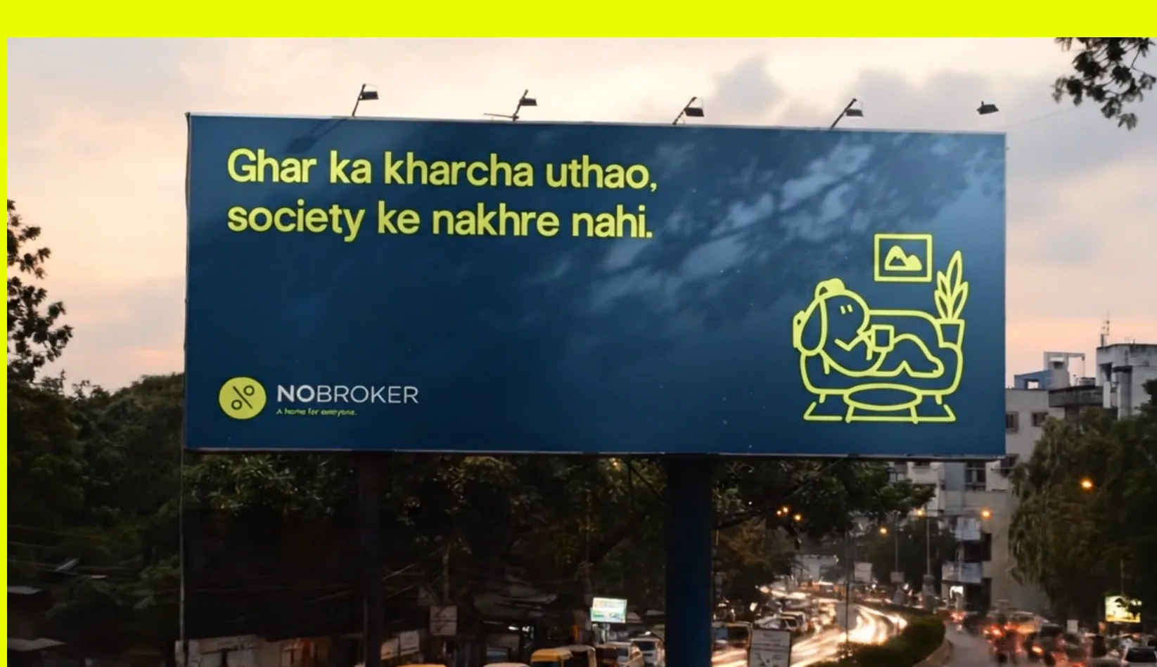
Billboard reading ‘Ghar ka kharcha uthao, society ke nakhre nahi’

Language sounds like a helpful friend, not a property agent: “home” instead of “property”, no pressure and no judgement.
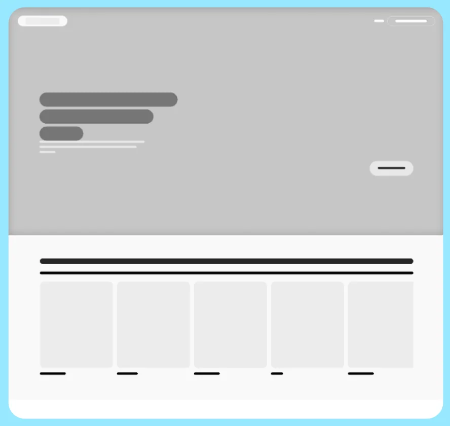
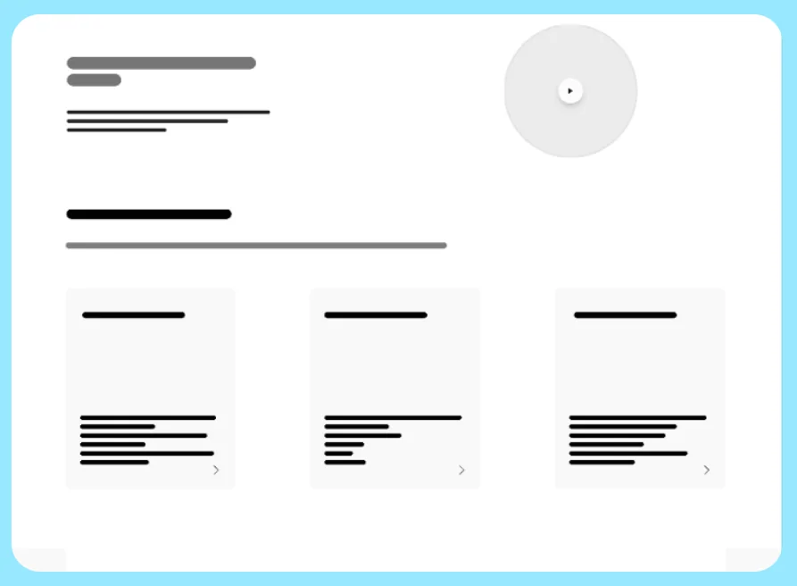
Wireframes

Low-fidelity wireframe 1
Low-fidelity wireframe 2
Low-fidelity wireframe 3
Low-fidelity wireframe 4
Low-fidelity wireframe 5
Low-fidelity wireframe 6

06 · Final screens

What changed on the screen

Redesigned homepage with a lived-in home photo and city cards
Homepage“Home” instead of “property”, real lived-in photography and city cards that invite browsing.
Redesigned services section with gender-neutral line illustrations
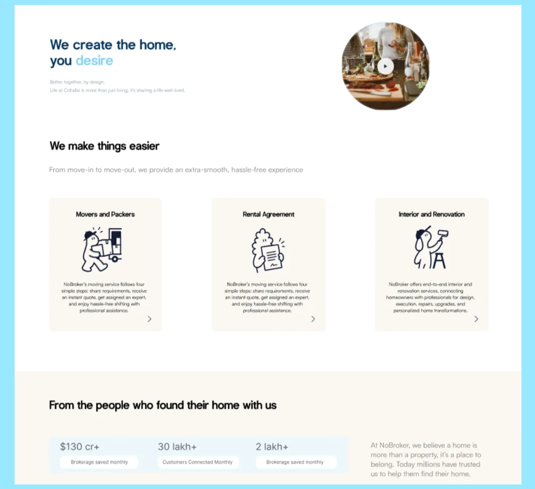
ServicesGender-neutral illustrations that don’t assign fixed roles, and curved, calm shapes.
Redesigned property page with preference tags and real amenity photos
Property pagePreference tags under the title, and real amenity photos instead of icons alone.

07 · Reflection

What I’d do differently

  • Lead with the problem, not the brand.Our strongest finding was practical: people learn about restrictions too late. I spent a lot of time on brand framework and values; next time I’d start from the transparency fix and let the brand follow.
  • Check contrast while choosing colours.Neon yellow looked great in the moodboard but disappears on off-white. Running contrast checks earlier would have shaped the usage rules from the start.
  • Test the chips with renters and owners.Next, I’d test whether chips like “Couple Friendly” are clear to both sides, and whether owners will fill them in honestly.